Amazon Facelift
Adding a new compare feature to Amazon's mobile app and cleaning up the app's design
Roles:
UX/UI Designer
Tools:
Figma
Whimsical
Context
I’m a big Amazon shopper, but I avoid using the mobile app due to its limited shopping experience. On the web, you can open up multiple tabs to help keep track of the items you want to decide between, you can effortlessly search the reviews, and the increase in screen real estate makes scrolling through product details more manageable. On mobile, you’re forced to either navigate back and forth between products to compare or use the cart as your compare bucket. Reviews cannot be searched in the review section, and you have to scroll forever when viewing product details. Given all of this, I set out to give Amazon’s mobile app a facelift and design a compare feature to make it more useful.
Challenges
Difficulty collecting and comparing products for potential purchase
Users currently have three ways to compare multiple options when looking for the right product to purchase; unfortunately, none of them are optimal:
- As they view different products, they can continuously navigate back and forth between their browsing history and the search page. This process requires them to leave their search by going to the profile tab, scrolling halfway down the screen to tap the “View your browsing history” button, and finally, comb through their history to find the previous product they want to view. The process introduces much friction and breaks the user’s shopping flow, especially when not all previously viewed search items are candidates for comparison. 2. They can find previously viewed items directly from the search results page. This process eliminates the need to navigate away from the search page compared to the previous option. However, it still requires the user to remember and find the products they care about. Also, if they’ve used different search terms during their shopping session, they’d have to search those terms to find the product they want. For example, a user can search “black headphones” and find a product they like, then search “wireless headphones” and find another product. If they wanted to view a product from the “black headphones” search, they’d have to search for “black headphones” again. 3. Users can use the cart to house their potential purchases. This option would eliminate the sifting problem that plagued the previous options but can lead to other headaches regarding an accurate checkout total. Say a user wanted to shop for a complete outfit under $150. After they add a couple of shirts, pants, and shoes to their cart, the cart’s total price would be useless. In addition, the organization and grouping of shirts, pants, and shoes would most likely get mixed up in the cart during the shopping session.
Furthermore, products in the cart display different information than the search results page. They are missing the rating, number of reviews, and delivery speed. Because of this, users will have to view the products individually if they want to know this information. Despite its drawbacks, the cart is the best option users have at the moment.
A long, arduous, and inconsistent product page with limitations
The mobile product page is exceptionally long, leading users to endless scrolling. There’s considerable visual clutter and distractions, with most of the product page being filled with links to similar products, deals, and ads. Product information is sprinkled here and there, with reviews at the bottom of the lengthy page. I’m sure the links to other products help to drive discovery, but there is substantial inconsistency in where product details are displayed and the type of information given.
Information Overload and Dynamic Content Location
There is a paralyzing amount of information on a few pages, like the home and product pages. The innumerable ads, products, and information on these pages can confuse and frustrate users. I feel like I’m on a treasure hunt when navigating these pages. Content location and information can be dynamic at times. For example, I can’t find my browsing history on the home page when it was just there yesterday. Luckily, it can be found on the profile page.
Approach
Competitor Analysis
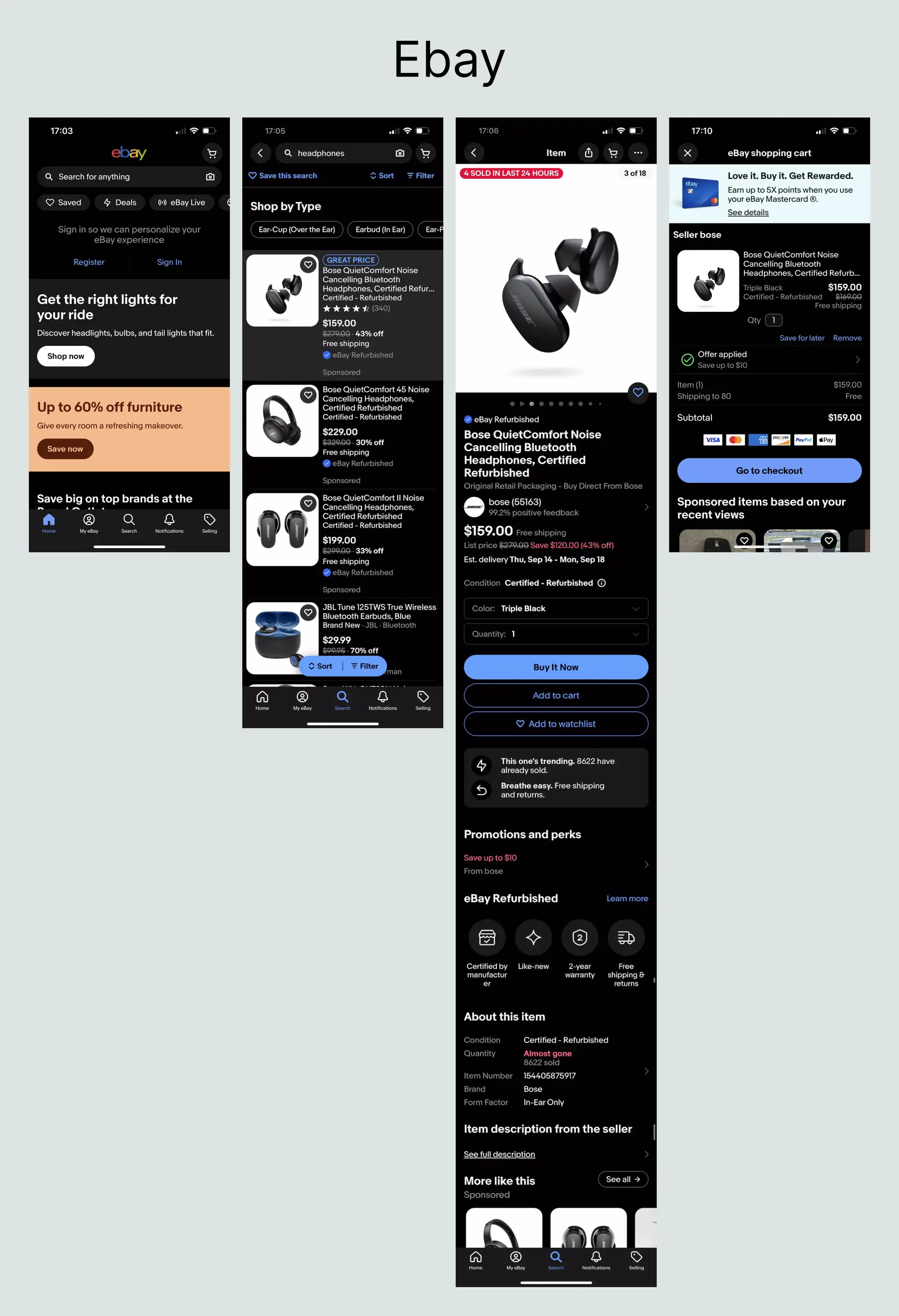
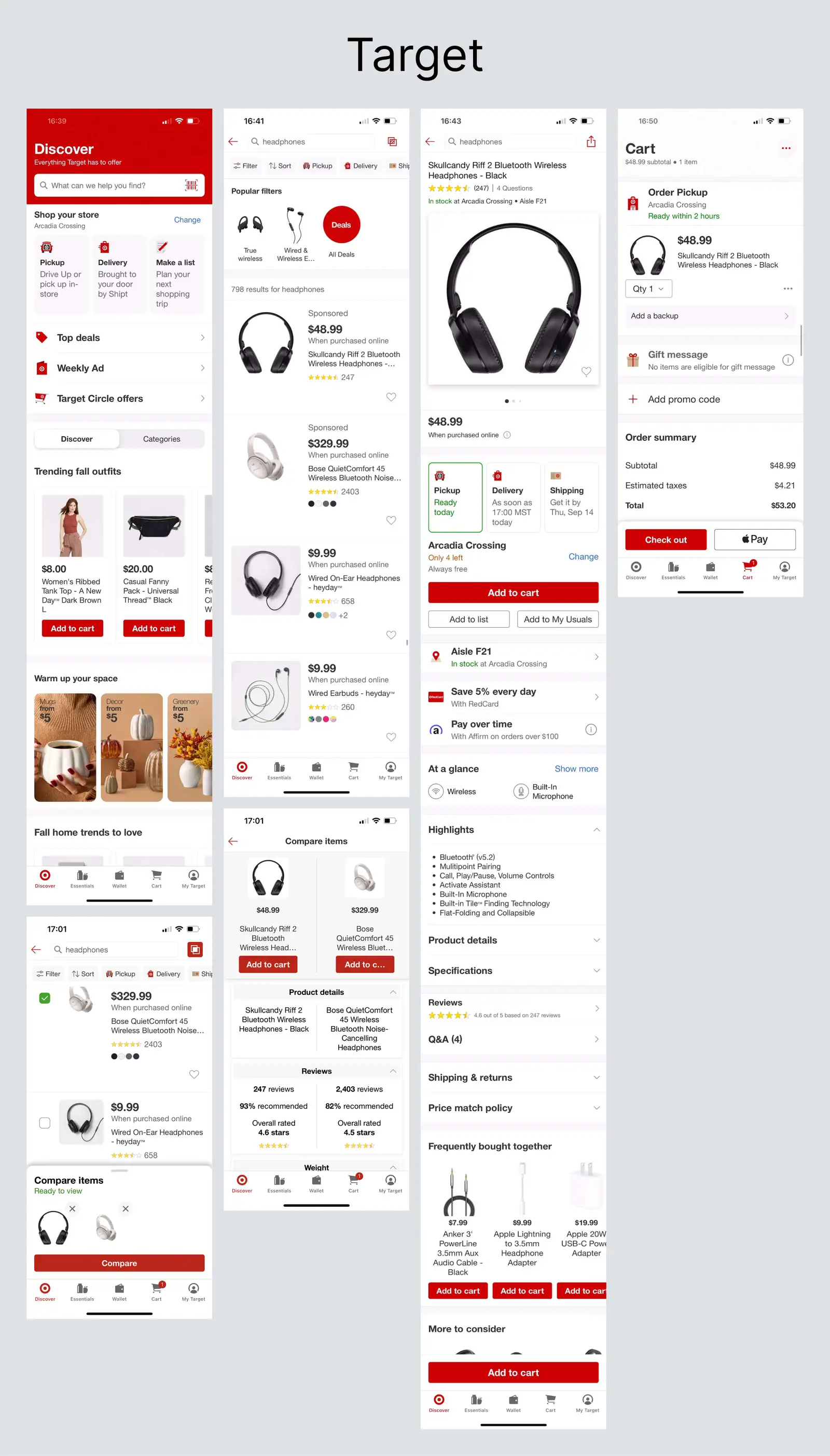
While brainstorming how to tackle the above-mentioned challenges, I checked out how Amazon’s competitors designed their mobile apps. Comparing eBay, Walmart, and Target, I believe Target offers the best experience. Their interface is simple and clean. It provides users with the information they need upfront and even allows them to compare two products side by side.

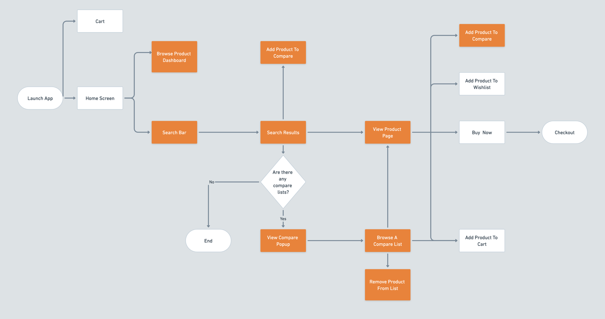
User Flow
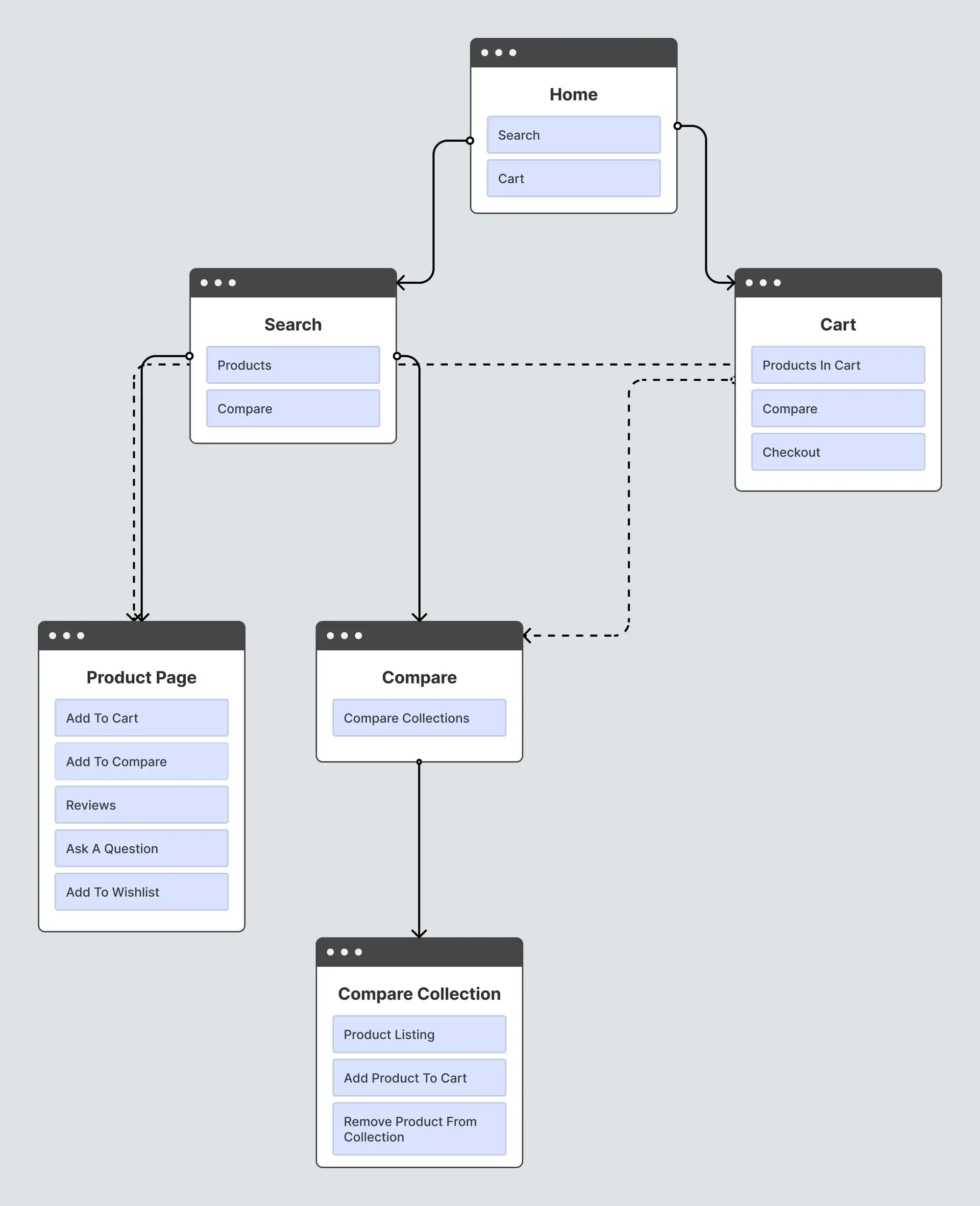
Sitemap
Wireframes
High Fidelity Mockups
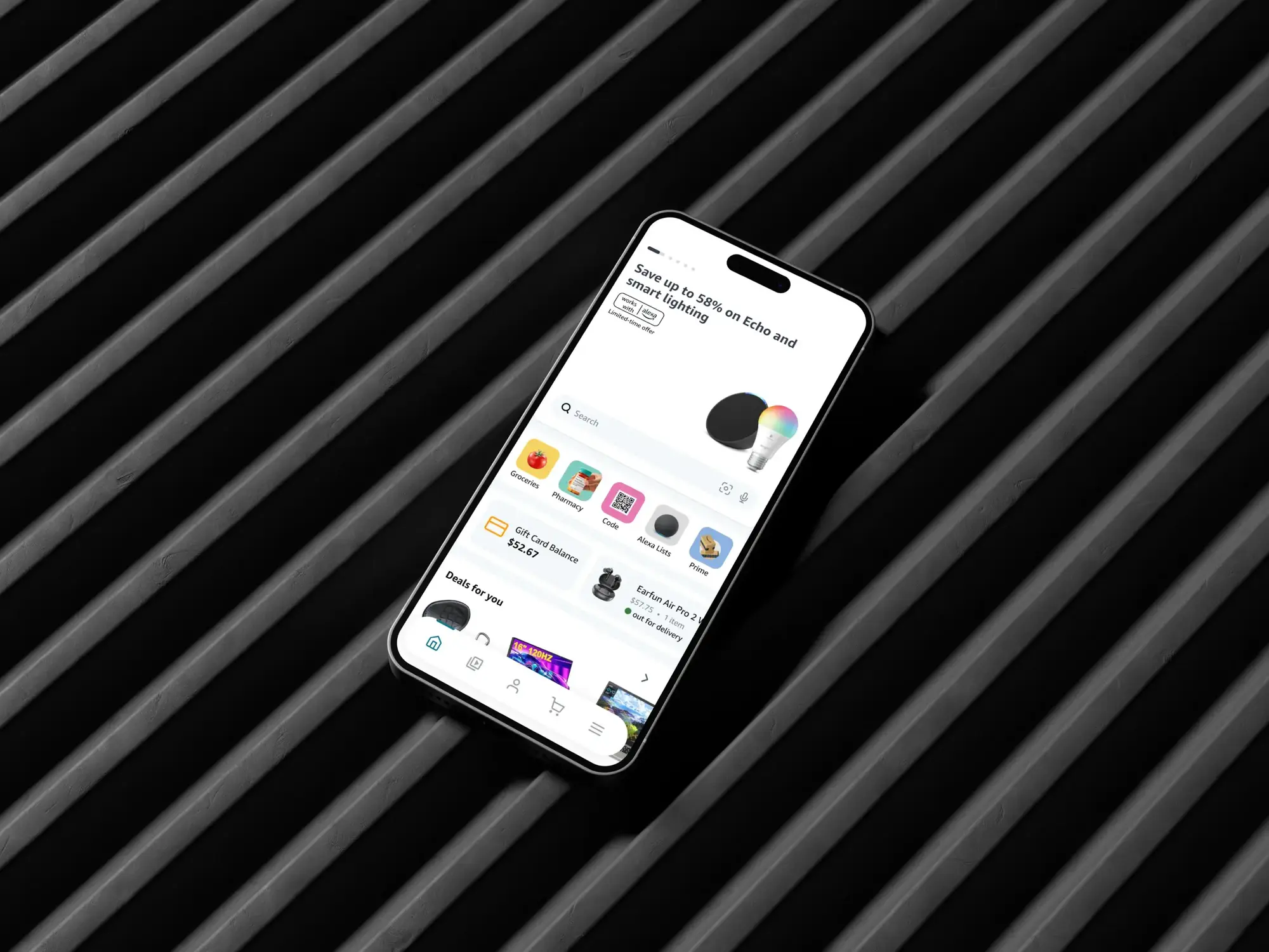
Home Page
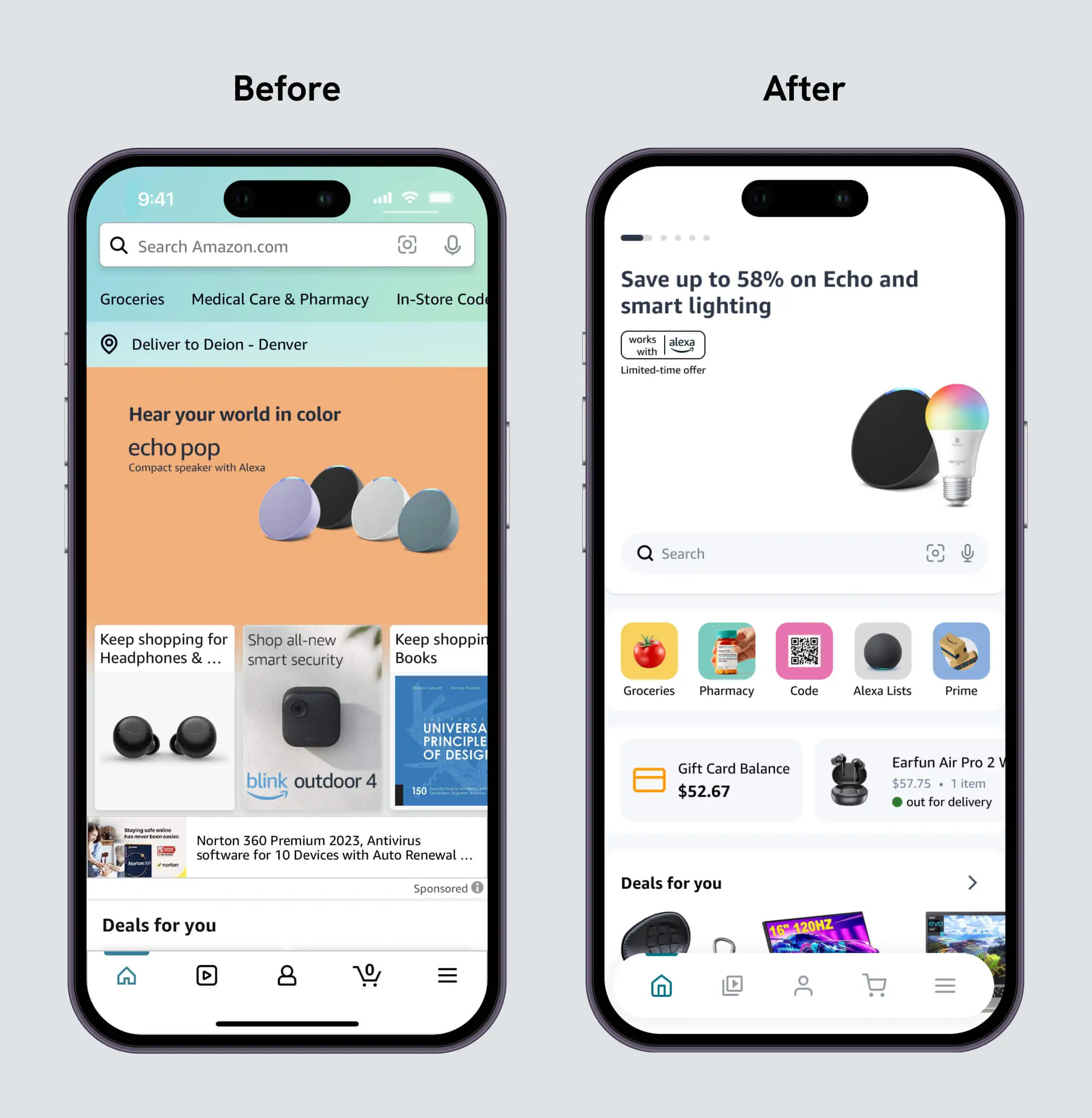
Amazon’s current home page design has a lot going on. There’s a fair amount of clutter with info cards stacked on top of the main CTA photo, odd spacing, and an overwhelming amount of offers, ads, and products. Users can easily overlook the navigation tabs at the top, given how they are secondary and blend in with the background.
To address these issues, I worked to clean up the overall look and ensure users could easily recognize beneficial actions and information. With the new design, users can effortlessly see their current order status, gift card balance, and navigation options.
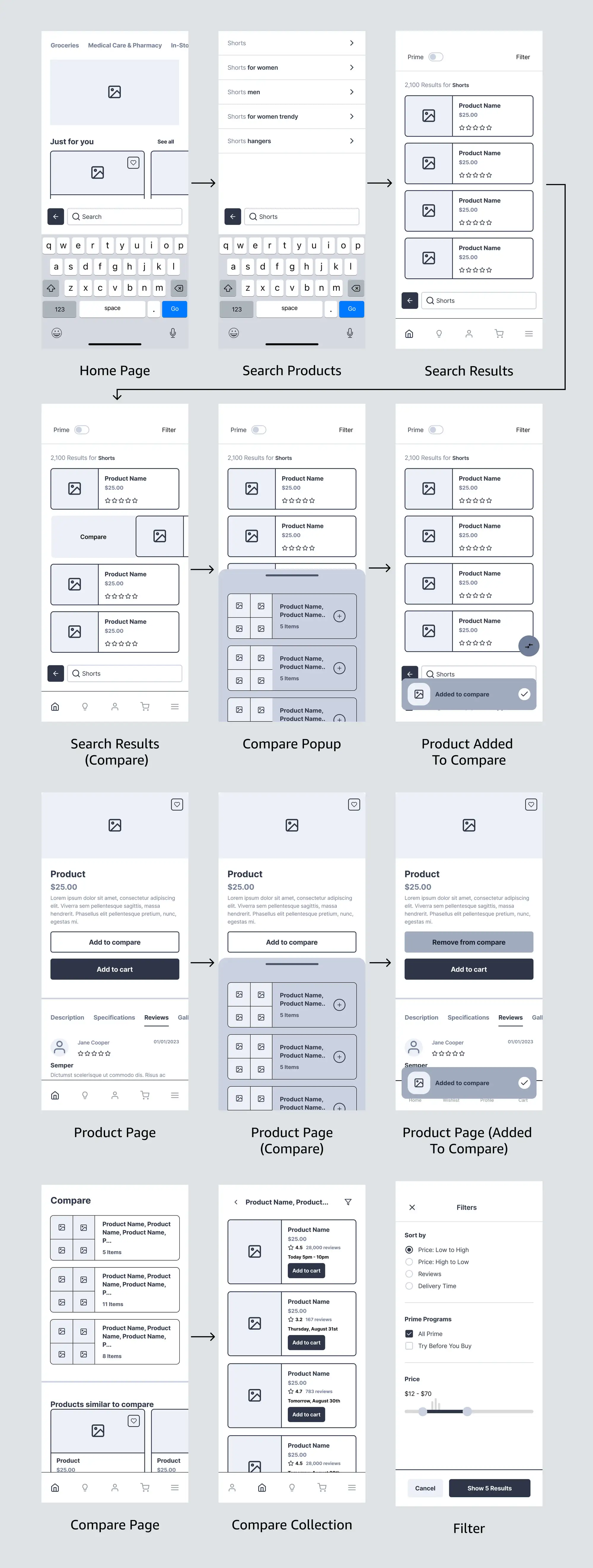
Search Page
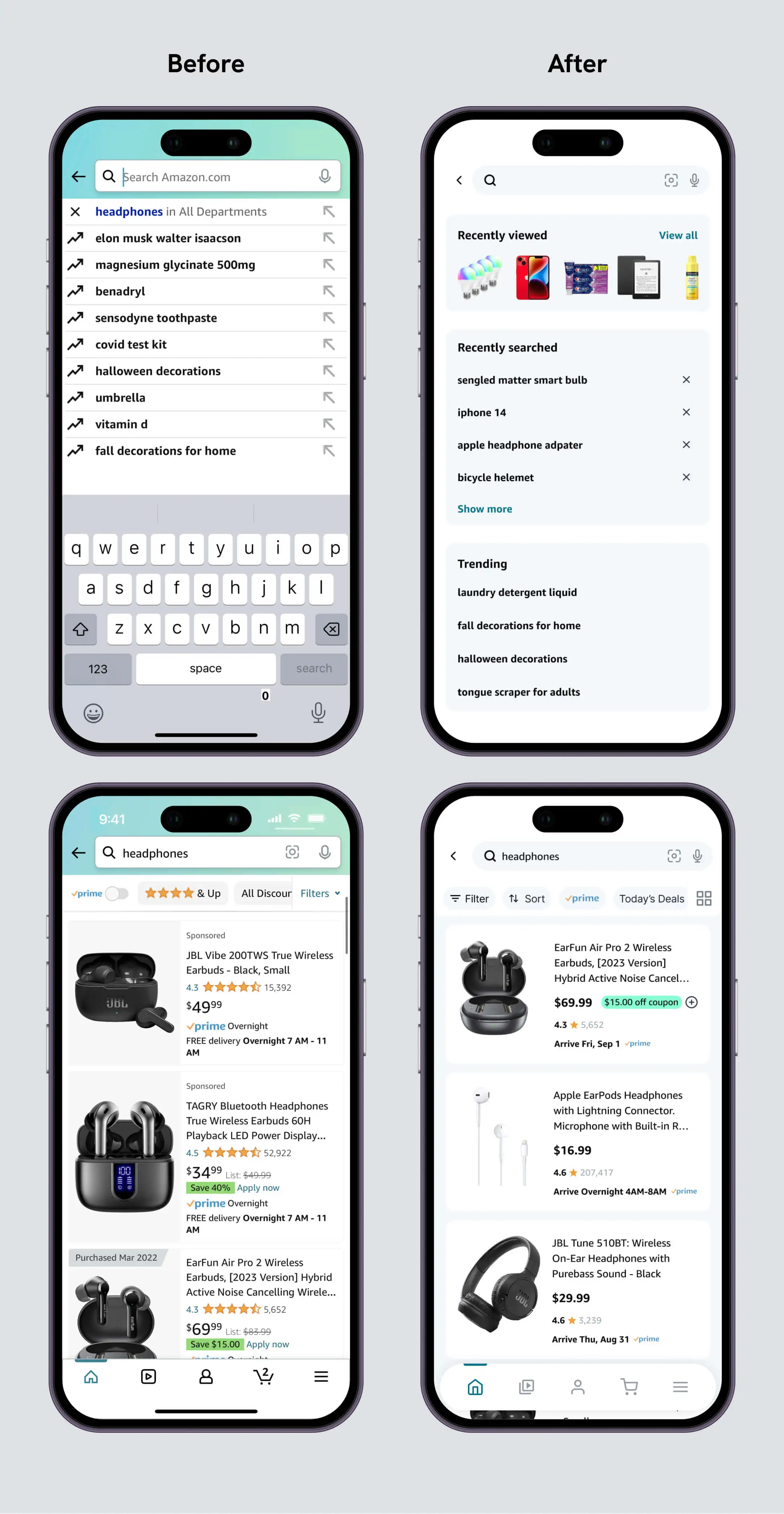
Amazon’s search input shows the user’s recent search terms and trending search terms. While helpful, it would also benefit from having the browsing history. This way, users can see what they recently searched for and the products they viewed.
I aimed to reduce visual clutter for the search results page while keeping all the essential details like rating, price, and delivery time.
The ability to toggle between a grid view and a list view is a great addition. With the grid view, the user can see more products on screen at the expense of not knowing the estimated arrival time.
Introducing a new feature, users can swipe right on a product to add to a compare list. If no lists are present, a new one will be created. Given that compare lists aren’t meant to be wishlists, they should automatically be removed after three days. This way, compare lists don’t pile up, and unnecessary storage and bandwidth aren’t used. This number should be tested and tweaked to fit user expectations and patterns.
Compare
Once products belong to a compare list, users can browse it to compare and choose the product that best suits their needs. Users can compare products in three views: side by side, a list, or a grid.
Users can sort the list to help them decide what to buy based on the lowest price, quickest delivery time, best rating, and more.
Once a product from the compare list is added to the cart, users are given the option to clear the list.
Product Page

The main goal of the product page was to instill some organization and avoid the need to scroll endlessly. I introduced tabs for different sections and collapsibles within these sections to accomplish this. These two combined help to make it easier for users to find the info they are looking for by reducing clutter, creating predictability, and avoiding information overload. As you can see in the photo above, Amazon’s current design is rather long, and I captured less than half of the entire page. It’s full page is 13x longer than my design.
I also added the ability to search reviews within the review section. I’m unsure why this was left out for the mobile app.
The product can also be added to a compare list on this page.
Excuse the poor quality due to the large image size, which negatively affected image compression. This is even more reason to shorten the product page :)
Cart
The objective of the cart facelift was to provide more helpful information and allow users to view their compare list. Amazon’s cart only displays the subtotal. The total, including taxes and discounts, is left for the checkout page. Maybe this is intentional. It’s possible that Amazon found users add more items to their cart if they aren’t aware of the accurate total beforehand. Without being sure, I figured it’d be favorable information to know, and it saves one extra click. I also included the ability to change the delivery address to the cart so that the total estimation would be accurate.
Prototypes
Search Flow
Compare Flow
Product Page Flow
Final Thoughts
I enjoyed working on this project and believe I improved Amazon’s design. Given all the information Amazon displays, it wasn’t a walk in the park, but I’m glad I could meet the challenge.